
Pepp
A cooking app to put a little “pepp” in your meal prep
Overview
Role
UX Researcher, UX/UI Designer
Team Size
1 designer
Timeframe
4 months
Deliverables
1 functioning prototype
Toolkit
Figma, FigJam, Adobe Illustrator, Maze
Background
Pepp is a cooking companion used to lessen the burden of an otherwise exhausting task, meal preparation. Users who cook at home but lack time and inspiration can quickly open their Pepp app to be reminded of favorite meals or to discover a new staple.
Problem
People across different lifestyles communicated that cooking is an overwhelming activity to balance with their already hectic schedules.
Goals
Pepp strives to provide a visual approach of choosing yummy recipes with the option to build custom recipe books and use step by step cooking guides geared toward the busy person.
Research
How might we make finding inspiration for a meal straight forward and faster for the user?
Competitive Analysis
Through reviewing other established cooking apps we can better understand features that are popular with users. The apps ranged from highly detailed like Umami, to very simplistic like SuperCook.
Additionally, identifying gaps in the market is perk.

Interviews
Pool Size
5 virtual interviews
User Dislikes
Thinking of new ideas
Going grocery shopping
User Priorities
Variety of ingredients,
simplicity in process,
exploring new foods,
timeliness preparation,
& health forward options
Goal
By speaking with users on their cooking experiences and habits in the kitchen we can better understand specifically what kind of product would be most beneficial.
Sample Questions
What kind of activities are you balancing in your daily life?
Shows how much time and mental capacity the user has available for tasks like cooking
What are your main goals when preparing meals?
Shows how we can narrow down the product features to ensure they are important to users
Are there any changes you would make to the cooking process?
Shows what is difficult for users for this topic and what they would need to improve their habits
“If I start too big it feels overwhelming and I’ll never do it.”
User Persona 1

“I usually prefer my meals to be quick, not overwhelming”
Name: Kaitlyn
Age: 33
Location: Los Angeles, CA
Family Status: single, no children
Occupation: Therapist
Hobbies: yoga, journaling, hiking, reading, she’s interested in it all!
Community: Kaitlyn is active in advocating for social and political justice on social media. She is too overwhelmed from her mentally demanding workload to heavily participate in her community. However, she enjoys socializing with her yoga and hiking friends.
“I’m trying to make it as easy as possible.”
Motivations
Efficiency
Taste
Variety
Health focused
Needs
To the point grocery stores are a dreaded place so straight forward information to complete tasks as soon as possible are vital
Doable feeling accomplished about creating a meal is imperative
Pain Points
Overwhelmed day-to-day activities are exhausting which leaves little mental capacity for meal prepping
Nutrition a variety of food sensitivities makes gathering ingredients stressful
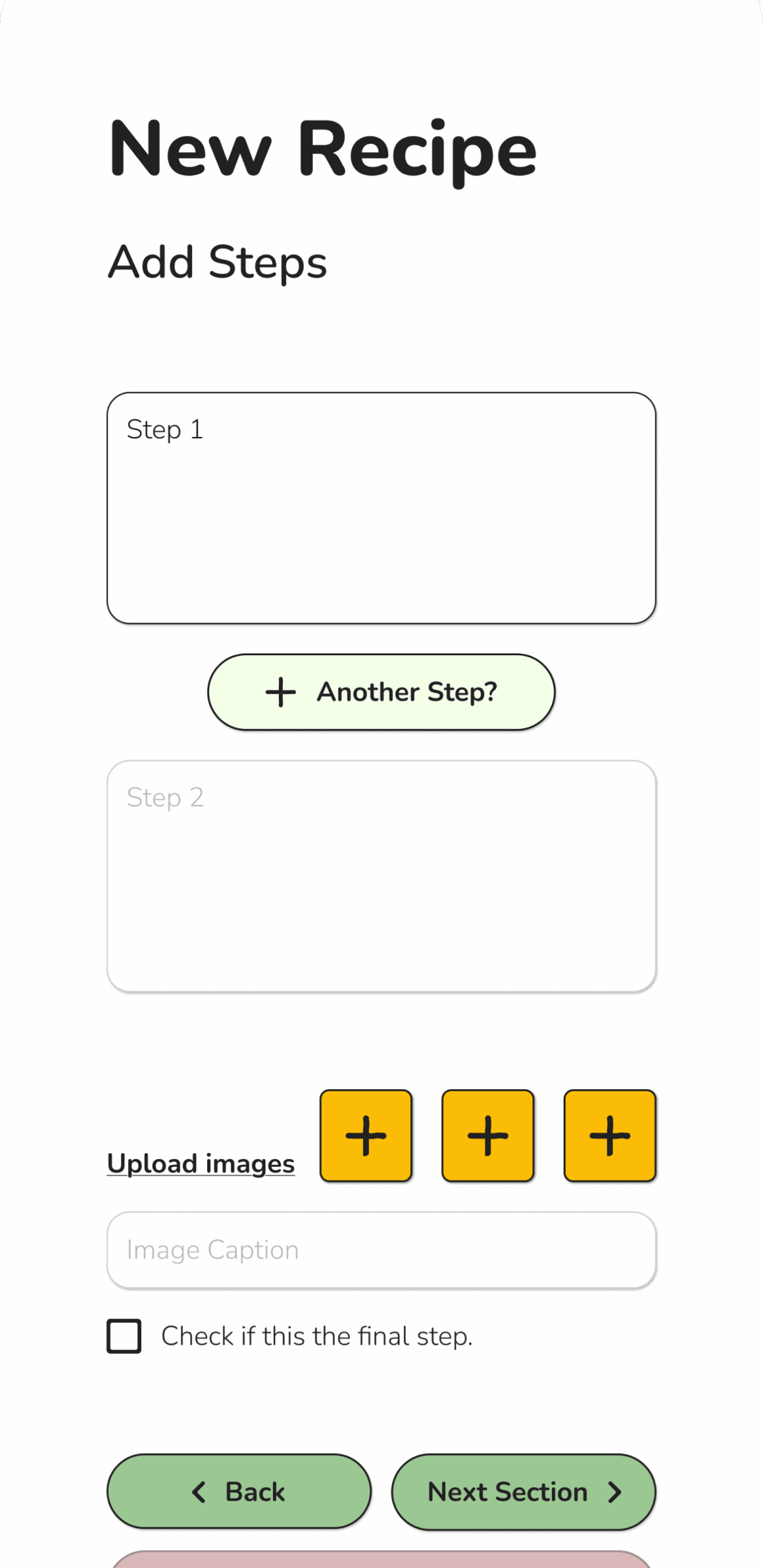
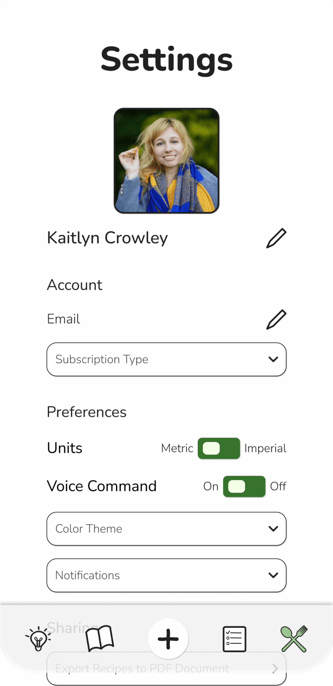
Screen Design
Sitemap
Priorities to Keep in Mind
Easily scrollable inspiration page
Clear categories which are easy to toggle back and forth
Learnings
Having the screens mapped out so visually is beneficial for double checking which features are absolutely necessary to include.

User Flow
Priorities to Keep in Mind
Interactive step by step cooking instructions
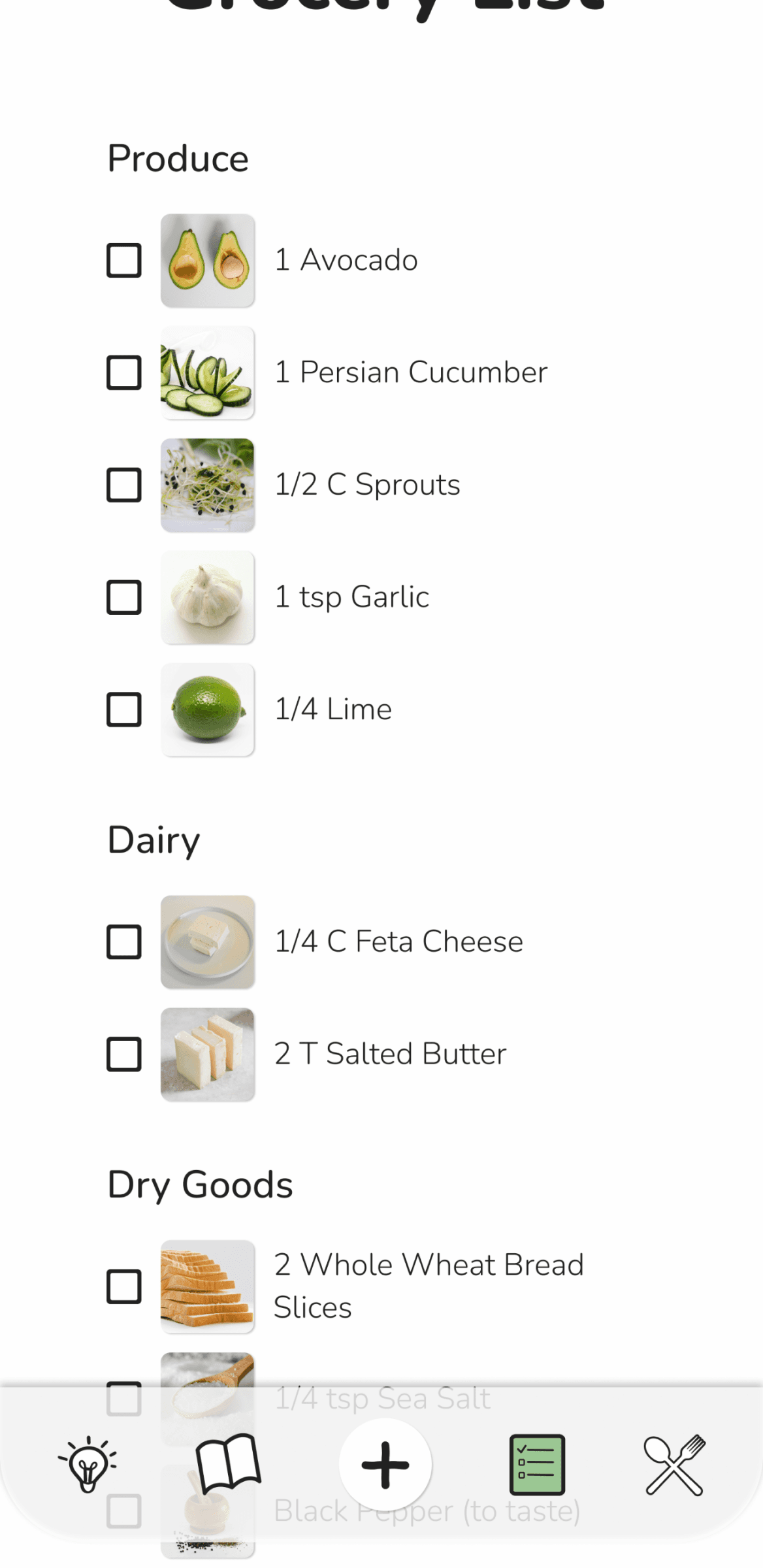
A simplified grocery list for focused shopping
Learnings
With more required screens than originally expected, it was important to narrow down the overall user goals to zone in on their needs.

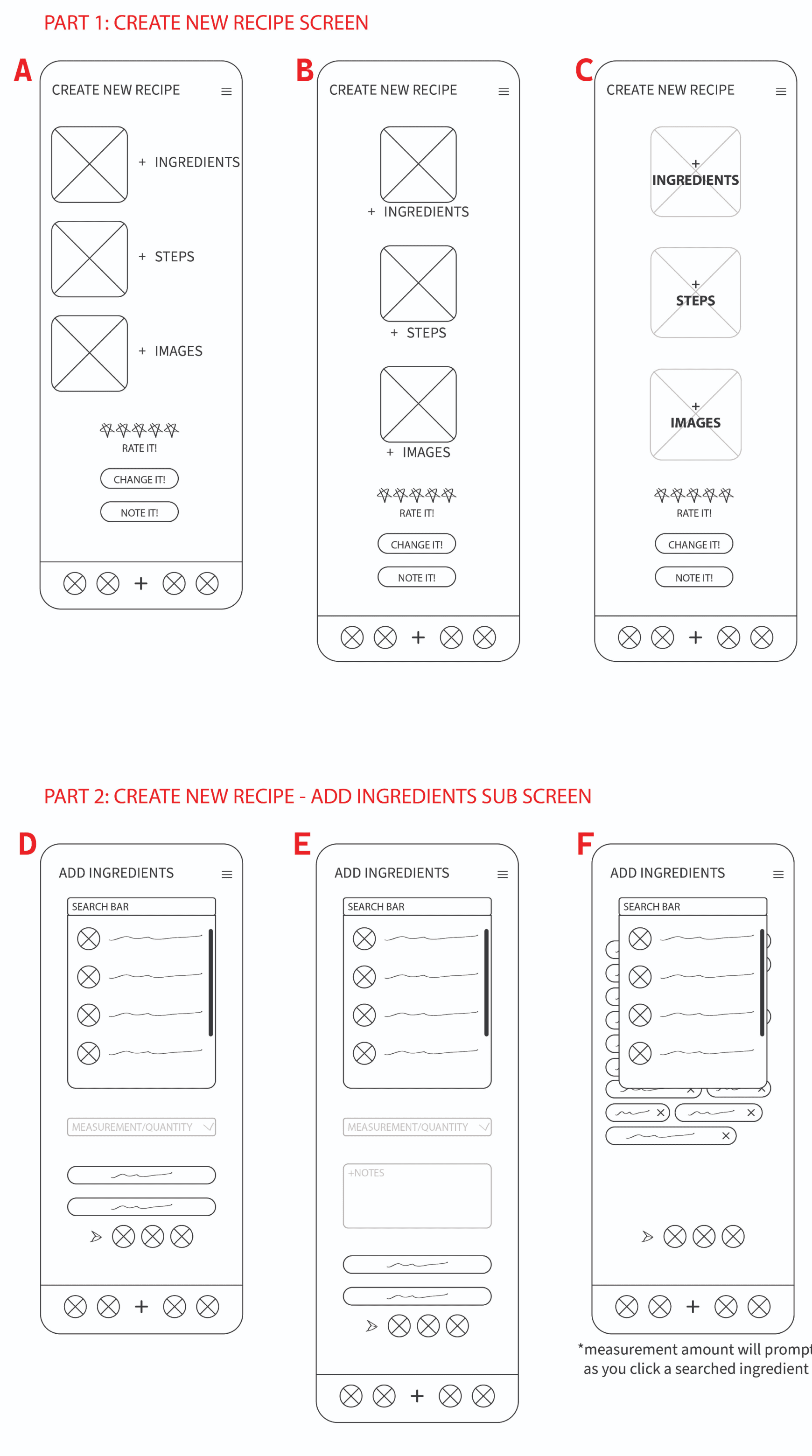
Usability Testing
The key tasks for screen development was to ensure customers would be able to navigate easily and also to balance the wants of the client.
Objective 1
Find the most clear option for laying out the New Recipe main screen.
Objective 2
Confirm if any unnecessary elements are included on the screen.
Participants
5 Users
Patterns
Comments of text being disruptive to flow based on its positioning. Vertical reading would prove more effective than horizontal + vertical.
Surprises
The consensus from all users in which screens would provide the most clear path to move through
Considerations
The design must be easy to find navigation paths for following along
What I learned
A hierarchy of elements is vital for good communicative design. This happens early in the defining stage but is best showcased for the first time in lo-fi wireframes.
Visual Design
Logo Development
It was important to have a clean and eye catching logo. This would include minimal details yet it was necessary to have a playful and inviting aesthetic to be inviting for users.
The idea was to play with cooking related shapes to incorporate into the logo. Utensils were an early option but were not working as they appeared too cluttered.
The final option used a pepper and stem.
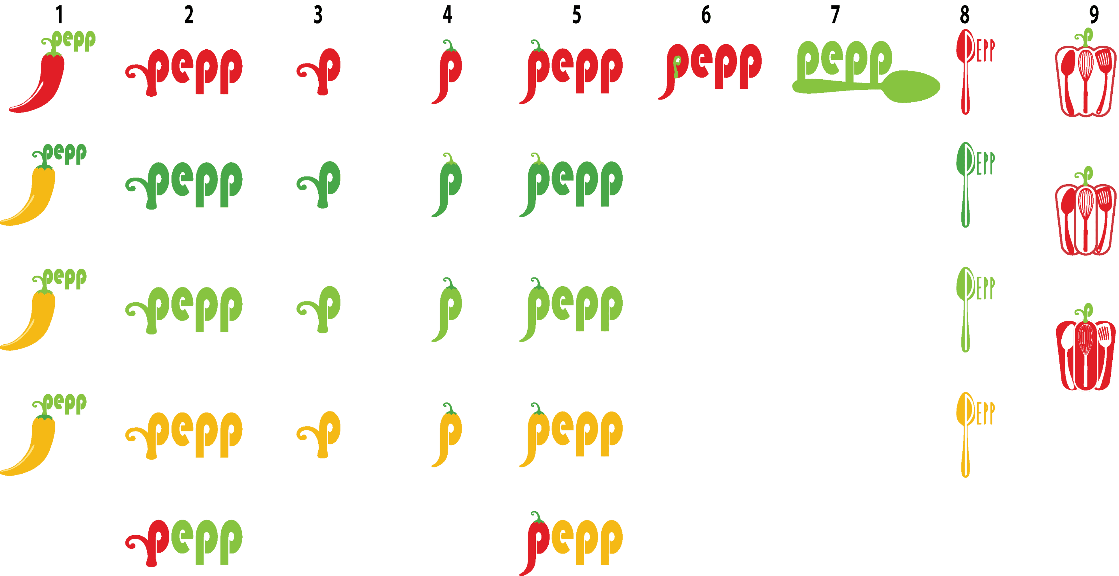
Final Logos
High Detail Logo
Desktop Logo
Mobile Logo
Colors
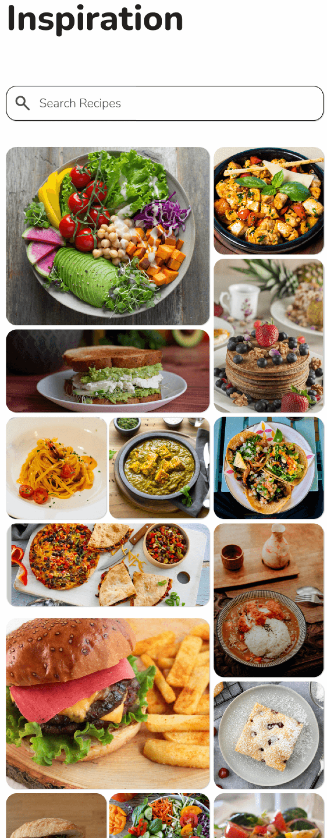
Inspiration
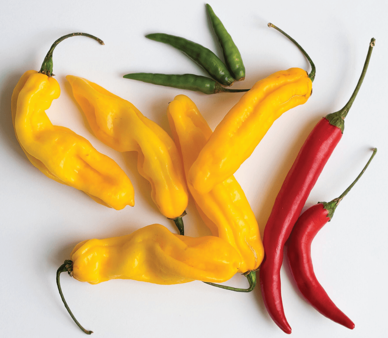
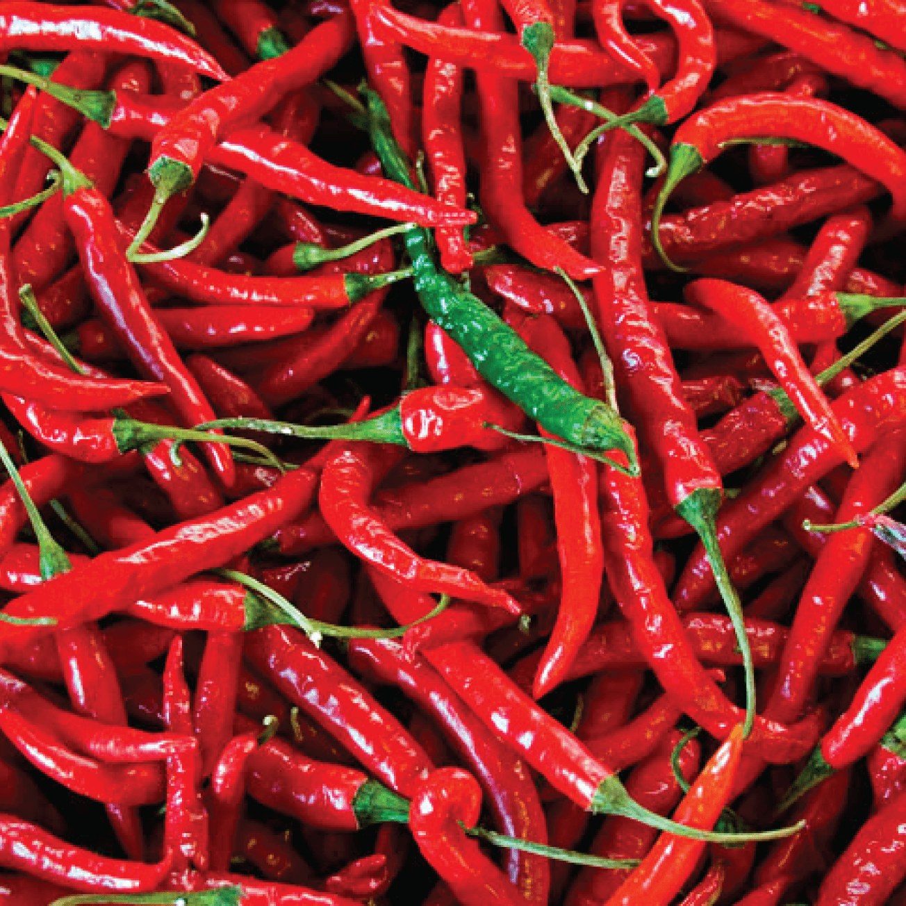
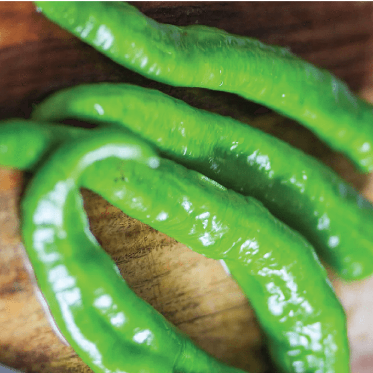
Colors were pulled from natural colors occurring in various types of peppers.
Different shades of each bright color are used to create dimension.
The colors read bright, fresh, and fun which is also what users want their meals to be like.
Final Colors
Primary Colors
#38732E
#9BC793
#8AC447
#CFF5A4
#F4FFE8
#F3B91A
#FFDE85
#FFF5DB
Secondary Colors
#871317
#DF1F26
#DE6A6E
#FAD9DA
Neutral Colors
#212121
#FEFEFE
#E0E0E0
Typography
The main goal for the typography was for ease of reading and stress. Sans serif was the best option to reach this goal as it is inviting.
The smooth corners of the main text, Nunito, convey joy and creativity.
Final Typography
Bauhaus 93, Regular, various
LOGO
Nunito, Black, 50px
CALL TO ACTION 1
Nunito, ExtraBold, 40px
HEADING 1
Nunito, Bold, 28px
SUB HEADING 1
Nunito, SemiBold, 24px
SUB HEADING 2
Nunito, Medium, 20px
SUB HEADING 3
Nunito, Regular, 18px
BODY TEXT 1
Nunito, Light, 16px
BODY TEXT 2
Nunito, Light, 14px
BODY TEXT 3
Nunito, Light, 14px
BLANK FIELD TEXT 1
Nunito, Bold, 14px
BUTTON TEXT 1
Nunito Medium, 14px
BUTTON TEXT 2
Usability Testing
6 participants who all cook at home provided feedback in improving the clarity of the product design. Unmoderated testing was conducted using the Maze platform.
Overview
Task #1
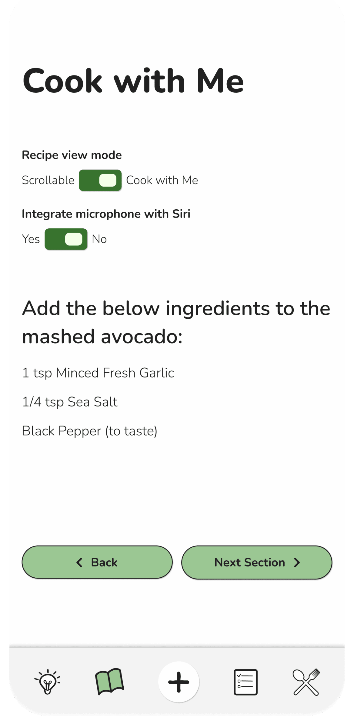
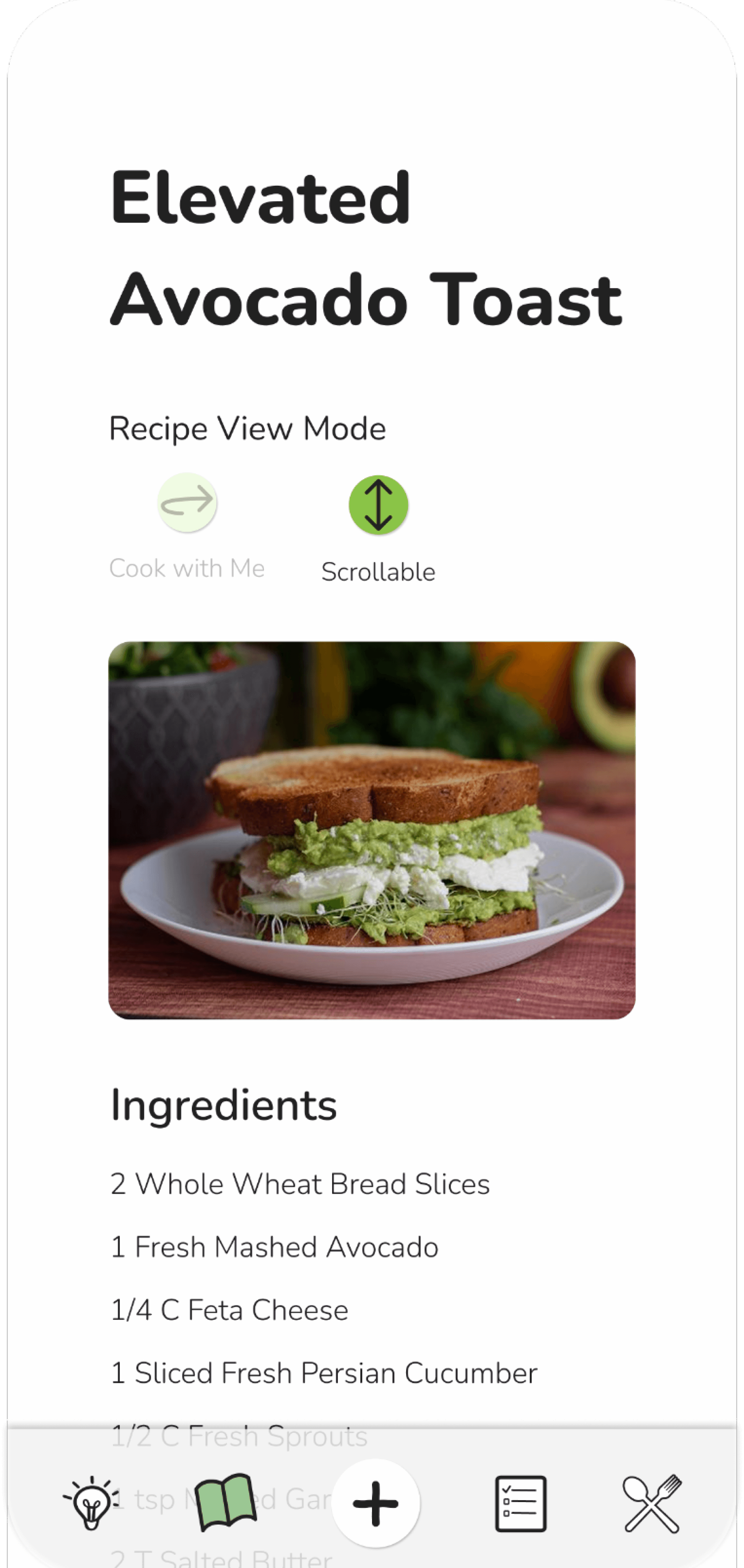
Locate the recipe for “Elevated Avocado Toast” and also use the “Cook with Me” function to view the entire recipe
Task #2
Toggle between “Scrollable” and Cook with Me” view modes
Outcome
5/6 users successful in completing task #1
6/6 users successful in completing task #2
Patterns
All users chose to find the requested recipe via image instead of trying to fill in the Search field.
Heat maps showed low to no misclicks across all users.
Surprises
Users were the most clear with the toggle option to switch between “Cook with Me” and “Scrollable”
Considerations
Choose one consistent way for users to switch between “Cook with Me” and “Scrollable” views.
Missing context for finding specific recipes.
Issue 1: Confusing Icon Communication
Task Summary
User testing participants were asked to find a horse with specific filter options.
The prompt as follows, “You are a horse breeder looking for a stallion that is 6-8 years old with a cremello blaze. How would you navigate to find a suitable option?”
Problem
Users searched for the filter options out of order than was intended during the wiring. This should have been accounted for as it is not a wrong method of reaching the task objective.
For accurate testing it is imperative that all possible options are wired for the screens to flow seamlessly.
Toggle mode

Icon mode


Solution
Update the view modes to be controlled by toggle, not icons.
Toggles are already of use elsewhere so this will also improve consistency.
Additionally, reduced the overall toggle size and revised the toggle switch to be green instead of yellow.
Consideration
This revision will take up more screen space. This will need to be top of mind if longer scrolling screens are added in the future.


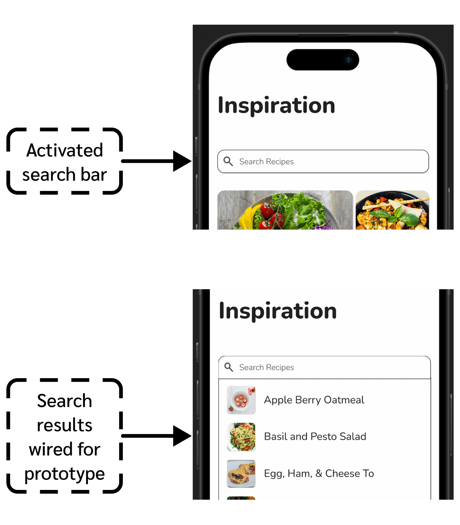
Issue 1: Missing Context for Finding Recipes
Task Summary
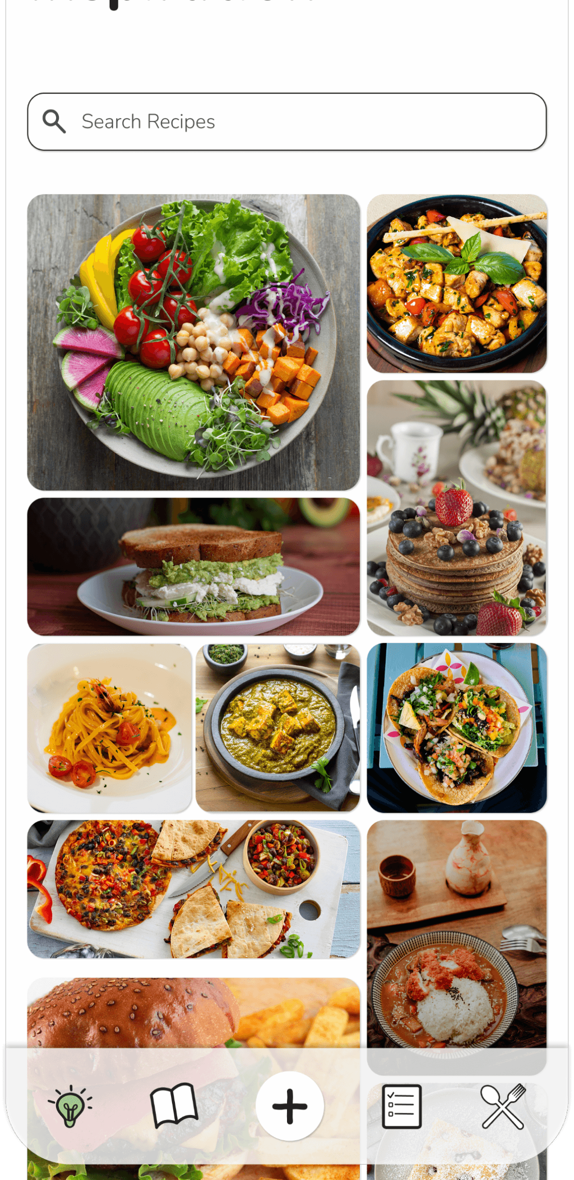
User testing participants were asked to find a specific recipe based on a description of “Elevated Avocado Toast”.
Problem
Users were all successful in finding the specific recipe without mistakes. However, they commented on some difficulty in doing so without any text clues.
Task’s requested recipe
Solution
Add a component for searching recipes dropdown menu. This is functionally wired in the prototype.
Clicking on the Elevated Avocado Toast is also wired to pull up the recipe.
Considerations
Users during testing did not try the Search function so this is not a sure fire way to solve the confusion.
Future more involved solutions may include adding filters at the top of the image feed. This way users can specifically potentially search types of cuisine, certain foods, categories, etc.
Conclusion
Challenges
Not having constant team feedback is always difficult. Coming from a background in fashion I’ve learned that I thrive off of collaborative design.
Remembering to step back and look at the whole picture is helpful to ensure details are not requiring more attention than necessary.
Lessons
It’s not always a direct translation of what the user says they want and therefore what should be incorporated into the design.
Determining what design would work best for the users’ interests rather than regurgitating what they say they’d want is key in UX design.
Alternatives
Adding more screens to this prototype would be beneficial to even better show ease of use and the product’s full potential.
Future
A larger research participant pool would be interesting to see how similar or different the insights would be.
Focusing on user exploration versus a set task list for hi-fi testing would produce more organic results.
Let’s chat!
gracie
bojorquez