

Andromeda - Integrated Calendar
Streamlining product organization within one product life management system
Overview
Role
UX Researcher, UX/UI Designer
Team Size
1 designer
Timeframe
6 months
Deliverables
6 unique screens wired for prototyping
Toolkit
Figma, FigJam, Adobe Illustrator, Maze
Background
Andromeda is a product life management (PLM) system for its parent company, NGC. The software is used in manufacturing for organizing goods, and in this case apparel, and housing all pertinent related information.
Apparel manufacturing professionals are often understaffed and rely on software to keep track of their busy workloads. These PLM systems are not updated frequently. Additionally, the professionals behind the software are rarely experts on what features are most useful.
Problem
PLM users often feel stressed with a heavy workload.
Using various systems to organize and cross update their data leads to sizable mistake potential.
Users are left feeling frustrated with inconsistent information & overwhelmed when it takes more time to finish tasks than it should.
Goals
Integrating the program used to monitor manufacturing timing for styles with the PLM program used for housing style information will remove a responsibility step.
This will also allow users to work in only one platform which saves time and stress from making as many potential mistakes.
Research
How might we help PLM users organize their large workloads in one program so that they don’t have to worry about mistakes from carrying information over to multiple platforms.
Competitive Analysis
Reviewing programs used for product management helps shed light on which features are most useful.
Excel is seen in the industry as archaic but offered many similar features in a more roundabout way.

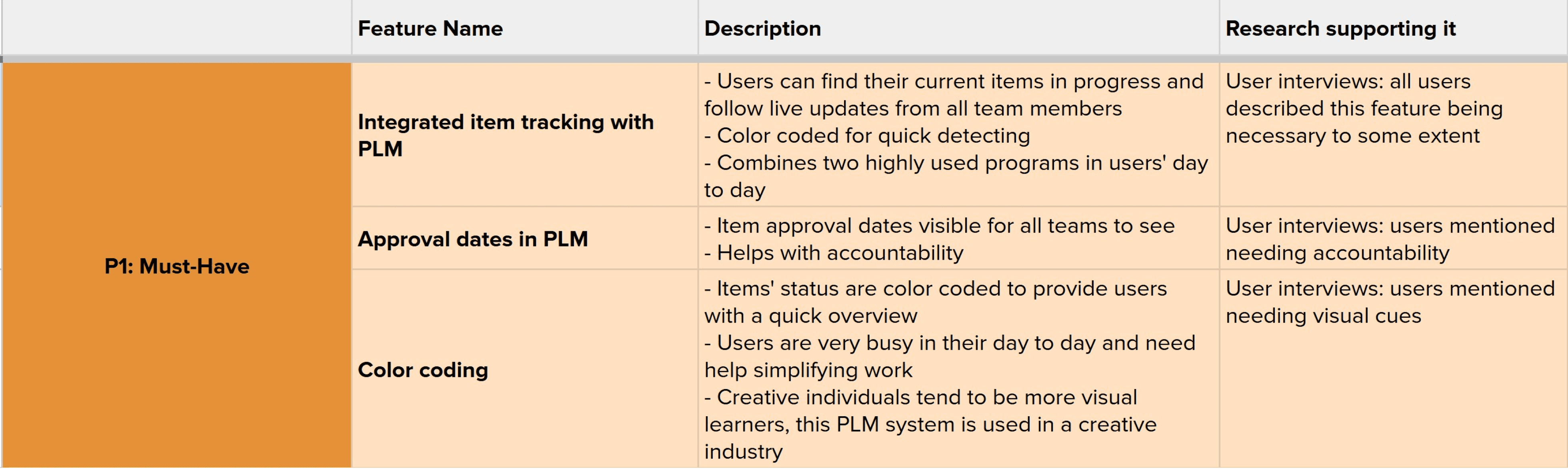
Feature Roadmap
Through reviewing competitors’ product life management systems we can better understand features that are popular with users. The websites all provided the same basic organization systems but varied in the depth of options.
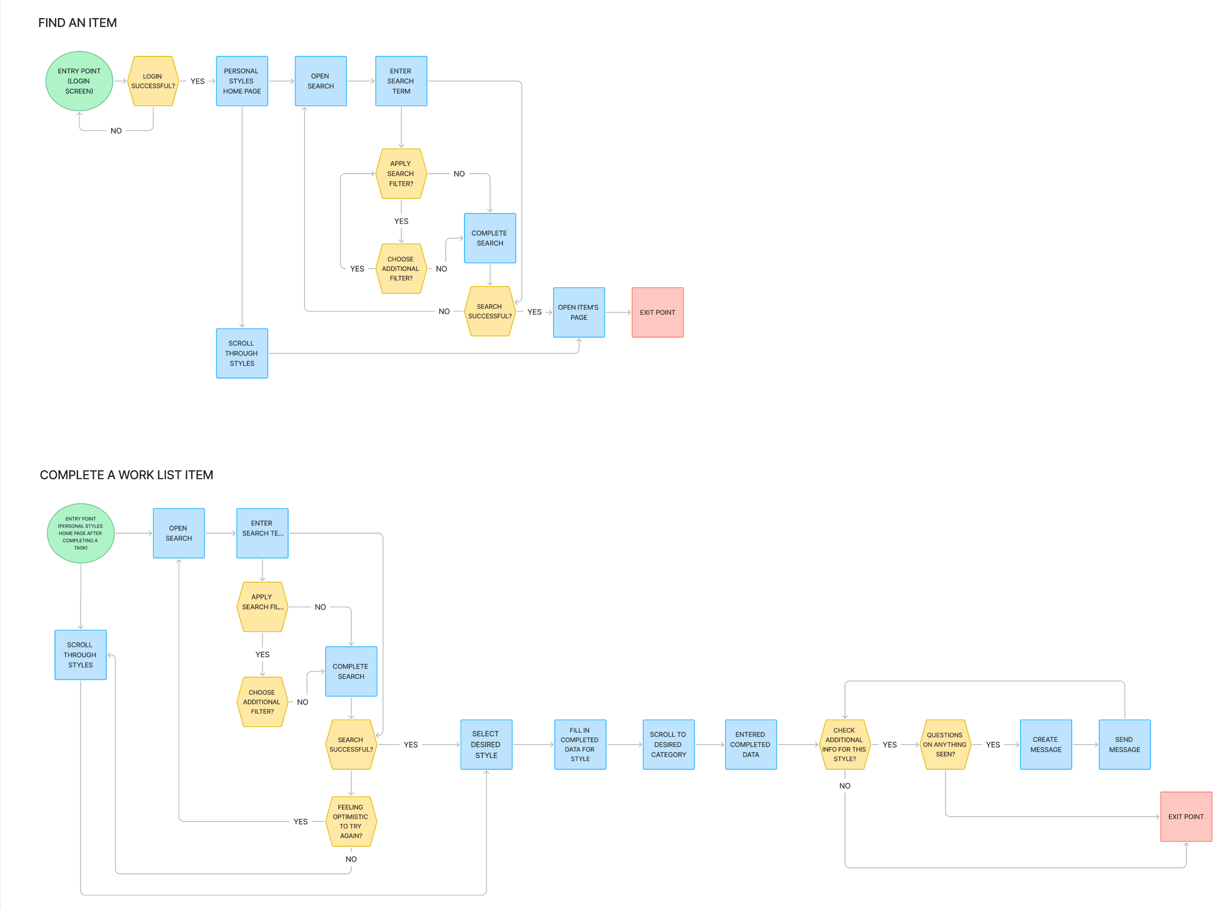
User Flow
Priorities to Keep in Mind
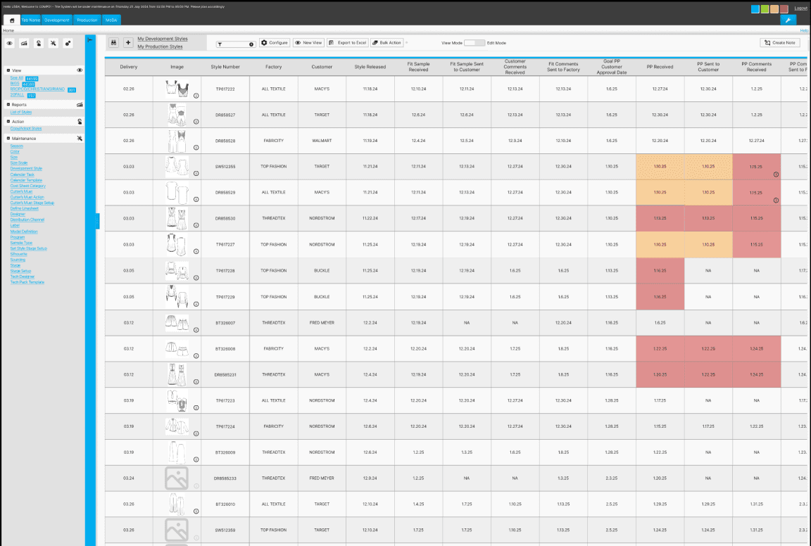
Integrated item tracking to be visible in the WIP (Work in Progress) table
Approval dates must be included in WIP
Learnings
The shape of process map symbols follows a standard. Updating these for the future will help ensure best communication to other team members.
Interviews
Pool Size
5 virtual interviews
User Dislikes
Inconsistent ways of using the program between coworkers,
Overwhelming amounts of tasks to complete,
It feels like there is never a break in the workload
User Priorities
clarity,
progress,
concise information,
consistency
Goal
By letting PLM users feel heard on their experiences and overall work habits we can better understand specifically what kind of added feature would be most beneficial to help users keep organized.
Sample Questions
What are the first words that come to mind when you think of using a PLM system?
Shows whether users view PLM as a positive or negative experience
Is there anything about PLM that you still find confusing to understand how to do?
Shows where there may be holes in the existing program to improve upon
What do you wish the PLM creators understood about your job?
Shows where the user is feeling unheard and how that can be improved
“It’s supposed to be streamlined.
I don’t think it’s 100% streamlined but it’s supposed to be.”
User Persona

“Almost everyone that works in the design world are a control freak”
Name: Cynthia
Age: 37
Location: Los Angeles, CA
Family Status: married, no children
Occupation: Apparel Designer
Hobbies: hiking, traveling, trying new restaurants
Community: advocates for the marginalized, politically outspoken, social butterfly
Motivations
Productivity
Job Retention
Joys
Creativity
Saving Time
Completion
Needs
Organization easy to navigate
Integration all in one place
Visual Cues denote imperative issues
Functionality simplistic & practical
Pain Points
Accountability personal responsibility
Consistency processes to be done the same
Efficiency “a faster way to get to the end point”
Missing information cannot find info that should be present
Time consuming a heavy workload & repetitive tedious tasks
Redundancies inconsistent repeated information
Low-fi Usability Testing
Usability Testing
Objective
Find the most efficient way to update information for an item by asking users how they would go about entering data for the specific item.
Participants
4 Users
Patterns
All users were focused on choosing options that would make their work lives easier and drew from personal experience to give insight
Users mentioned importance of successful communication with teammates
Surprises
Users preferred the more spaced out work in progress page due to its easier readability and increased spacing between elements.
This was unexpected because the original product design is crowded.
Considerations
Users mentioned not liking having to type out information, drop down menus would be beneficial.
Keep users’ feedback about spacing in mind but also acknowledge how many items users may be sifting through. They don’t want to scroll forever just to find one item.
What I learned
Consistency is key for accurate testing. I used different nav bar designs which I didn’t realize would throw off and confuse participants.

Design
Colors
The original Andromeda software uses a limited color approach.
They utilize bright flashy colors for warnings & alerts. Blue is their main call to action & accent color.
Neutral blacks, greys, & white are found throughout majority of the product.
Primary Colors
#AAAAAA
#E1E1E1
#F6F6F6
Secondary Colors
#00ADEF
#9ACB34
#FCAD44
#FCAD44
Neutral Colors
#202020
#F9F9F9
Typography
One of the biggest disappointments for the UI design throughout this product are the font sizes. They are extremely small throughout and difficult to see even on large screens.
I followed the product’s standard for this added feature but would update to be much larger for the future.
Actual Size
Inter, Regular, 10px
Headlines
Inter, Regular, 7px
Copy, Buttons
Inter, Regular, 5.4px
Company Alerts
Enlarged for Better View
Inter, Regular, 10px
Headlines
Inter, Regular, 7px
Copy, Buttons
Inter, Regular, 5.4px
Company Alerts


Usability Testing
5 participants who have worked with this particular PLM system or similar provided feedback in learning how intuitive the task would be.
Overview
Task #1
Navigate to the “My Work in Progress” screen
Task #2
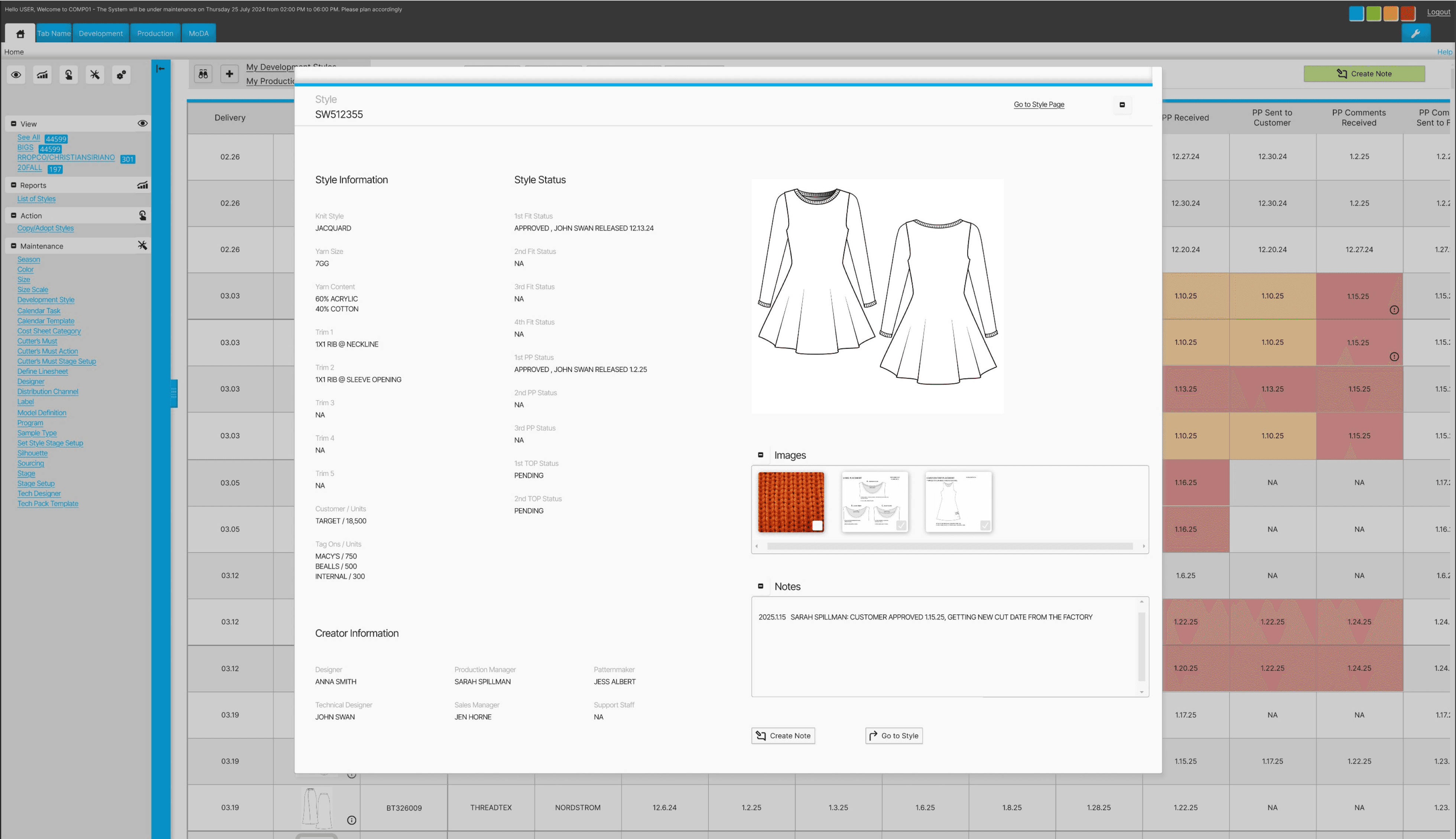
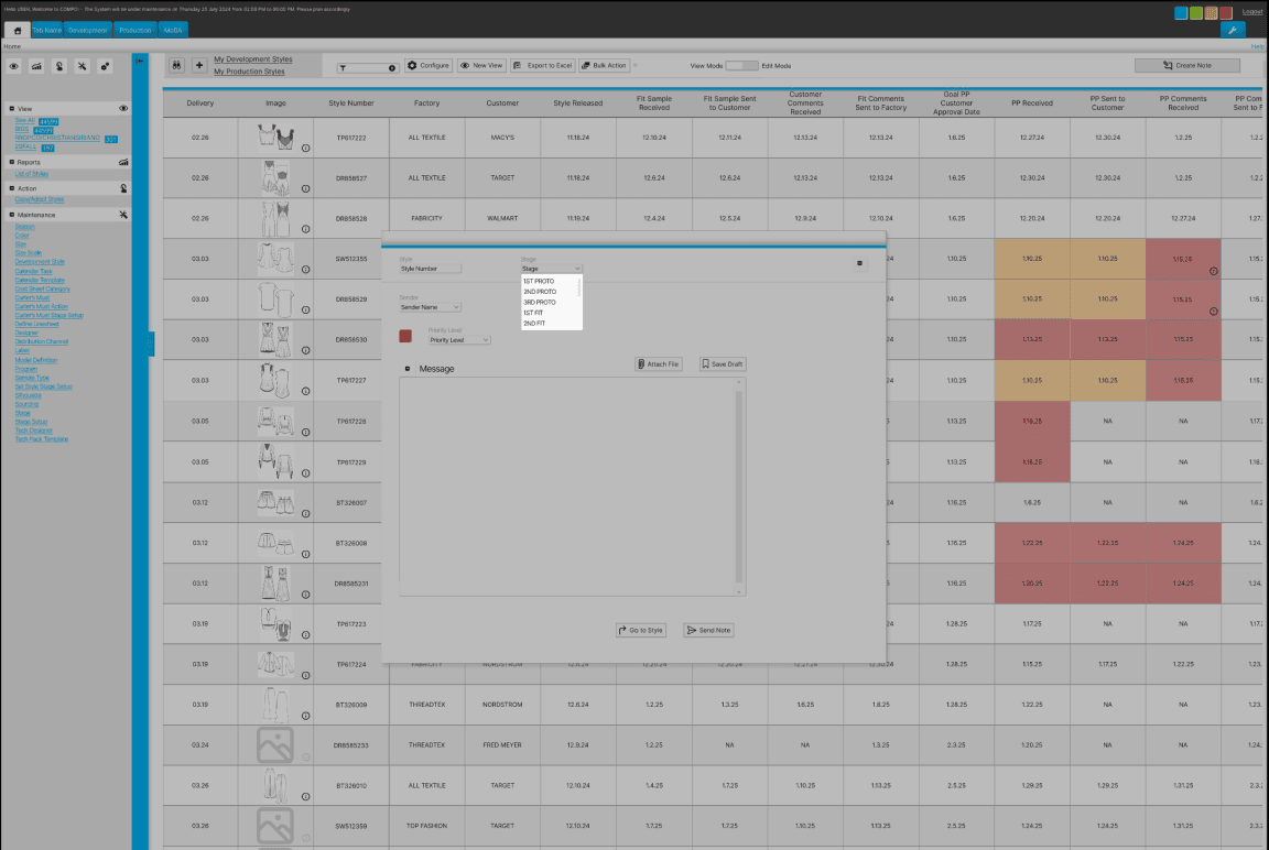
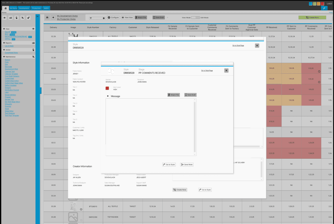
Send a note for style SW512355
Outcome
5/5 users successful in completing task #1
5/5 users successful in completing task #2
Patterns
All users were able to complete both tasks with the second task taking significantly more time than the first.
Users looked in the side navigation menu first to find the requested CTA button.
Surprises
Even though all users were able to complete both tasks it was curious how much easier the 1st task was to complete than the 2nd since the 2nd task had more steps.
Considerations
Button visibility for users so they are not too hidden or blended in with other information on the screen is a necessary revision.
The challenge presented is maintaining the original product’s aesthetic, which is quite busy, while also improving the UX.
Issue: Hidden Button
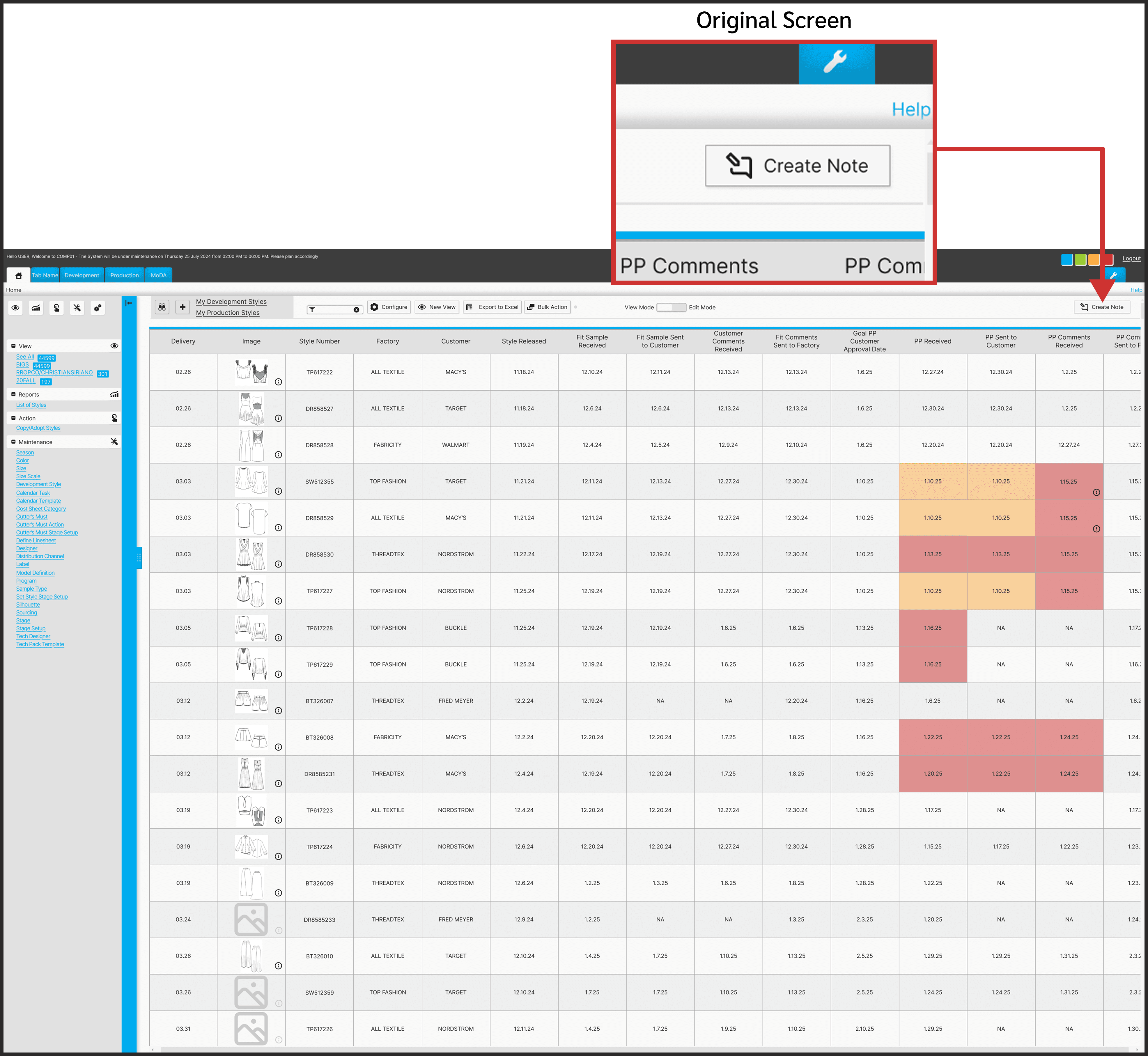
Task Summary
User testing participants were asked to find the correct path in order to send a note.
Problem
Users struggled to find the button to create a note due to its combination of obscurity and positioning.
Solution
Increasing the button width and also revising the color to be more attention grabbing will help users easily spot the create note button.
Consideration
Maintaining the overall aesthetic of the original platform was pertinent. Had this not have been an added feature of a preexisting product then a totally different design approach would have been utilized to reduce visual clutter.
Some features leading to user difficulties are:
1. Small text
2. Elements very close together, making it tough for users to easily navigate to their desired links.
3. Repetitive elements and links on the same screen
Conclusion
Challenges
Working on designing only one new feature for a product that has so many user complaints made for quite the challenge.
Maintaining objectively bad design features for users’ best experiences is almost painful. However, if I would have changed the product so much it would have missed the point of the assignment.
Lessons
The area where I gained the most confidence was within the interview portion. It helped having a familiar personal topic in which aided in having more natural conversations with users.
Alternatives
Adding more screens to this prototype would be beneficial to even better show ease of use and the product’s full potential.
Future
It would be interesting to build on this product and improve other areas. Users struggled with finding basic pages and redesigning those paths to be more clear would be rewarding.
Let’s chat!
gracie
bojorquez
Andromeda - Integrated Calendar
Streamlining product organization within one product life management system
Overview
Role
UX Researcher, UX/UI Designer
Team Size
1 designer
Timeframe
6 months
Deliverables
6 unique screens wired for prototyping
Toolkit
Figma, FigJam, Adobe Illustrator, Maze
Background
Andromeda is a product life management (PLM) system for its parent company, NGC. The software is used in manufacturing for organizing goods, and in this case apparel, and housing all pertinent related information.
Apparel manufacturing professionals are often understaffed and rely on software to keep track of their busy workloads. These PLM systems are not updated frequently. Additionally, the professionals behind the software are rarely experts on what features are most useful.
Problem
PLM users often feel stressed with a heavy workload.
Using various systems to organize and cross update their data leads to sizable mistake potential.
Users are left feeling frustrated with inconsistent information & overwhelmed when it takes more time to finish tasks than it should.
Goals
Integrating the program used to monitor manufacturing timing for styles with the PLM program used for housing style information will remove a responsibility step.
This will also allow users to work in only one platform which saves time and stress from making as many potential mistakes.
Research
How might we help PLM users organize their large workloads in one program so that they don’t have to worry about mistakes from carrying information over to multiple platforms.
Competitive Analysis
Reviewing programs used for product management helps shed light on which features are most useful.
Excel is seen in the industry as archaic but offered many similar features in a more roundabout way.
Feature Roadmap
Through reviewing competitors’ product life management systems we can better understand features that are popular with users. The websites all provided the same basic organization systems but varied in the depth of options.

User Flow
Priorities to Keep in Mind
Integrated item tracking to be visible in the WIP (Work in Progress) table
Approval dates must be included in WIP
Learnings
The shape of process map symbols follows a standard. Updating these for the future will help ensure best communication to other team members.

Interviews
Pool Size
5 virtual interviews
User Dislikes
Inconsistent ways of using the program between coworkers,
Overwhelming amounts of tasks to complete,
It feels like there is never a break in the workload
User Priorities
clarity,
progress,
concise information,
consistency
Goal
By letting PLM users feel heard on their experiences and overall work habits we can better understand specifically what kind of added feature would be most beneficial to help users keep organized.
Sample Questions
What are the first words that come to mind when you think of using a PLM system?
Shows whether users view PLM as a positive or negative experience
Is there anything about PLM that you still find confusing to understand how to do?
Shows where there may be holes in the existing program to improve upon
What do you wish the PLM creators understood about your job?
Shows where the user is feeling unheard and how that can be improved
“It’s supposed to be streamlined.
I don’t think it’s 100% streamlined but it’s supposed to be.”
User Persona
“Almost everyone that works in the design world are a control freak”
Name: Cynthia
Age: 37
Location: Los Angeles, CA
Family Status: married, no children
Occupation: Apparel Designer
Hobbies: hiking, traveling, trying new restaurants
Community: advocates for the marginalized, politically outspoken, social butterfly
Motivations
Productivity
Job Retention
Joys
Creativity
Saving Time
Completion
Needs
Organization easy to navigate
Integration all in one place
Visual Cues denote imperative issues
Functionality simplistic & practical
Pain Points
Accountability personal responsibility
Consistency processes to be done the same
Efficiency “a faster way to get to the end point”
Missing information cannot find info that should be present
Time consuming a heavy workload & repetitive tedious tasks
Redundancies inconsistent repeated information
Low-fi Usability Testing
Usability Testing
Objective
Find the most efficient way to update information for an item by asking users how they would go about entering data for the specific item.
Participants
4 Users
Patterns
All users were focused on choosing options that would make their work lives easier and drew from personal experience to give insight
Users mentioned importance of successful communication with teammates
Surprises
Users preferred the more spaced out work in progress page due to its easier readability and increased spacing between elements.
This was unexpected because the original product design is crowded.
Considerations
Users mentioned not liking having to type out information, drop down menus would be beneficial.
Keep users’ feedback about spacing in mind but also acknowledge how many items users may be sifting through. They don’t want to scroll forever just to find one item.
What I learned
Consistency is key for accurate testing. I used different nav bar designs which I didn’t realize would throw off and confuse participants.
Design
Colors
The original Andromeda software uses a limited color approach.
They utilize bright flashy colors for warnings & alerts. Blue is their main call to action & accent color.
Neutral blacks, greys, & white are found throughout majority of the product.
Primary Colors
#AAAAAA
#E1E1E1
#F6F6F6
Secondary Colors
#00ADEF
#9ACB34
#FCAD44
#FCAD44
Neutral Colors
#202020
#F9F9F9
Typography
One of the biggest disappointments for the UI design throughout this product are the font sizes. They are extremely small throughout and difficult to see even on large screens.
I followed the product’s standard for this added feature but would update to be much larger for the future.
Actual Size
Inter, Regular, 10px
Headlines
Inter, Regular, 7px
Copy, Buttons
Inter, Regular, 5.4px
Company Alerts
Enlarged for Better View
Inter, Regular, 10px
Headlines
Inter, Regular, 7px
Copy, Buttons
Inter, Regular, 5.4px
Company Alerts
Usability Testing
5 participants who have worked with this particular PLM system or similar provided feedback in learning how intuitive the task would be.
Overview
Task #1
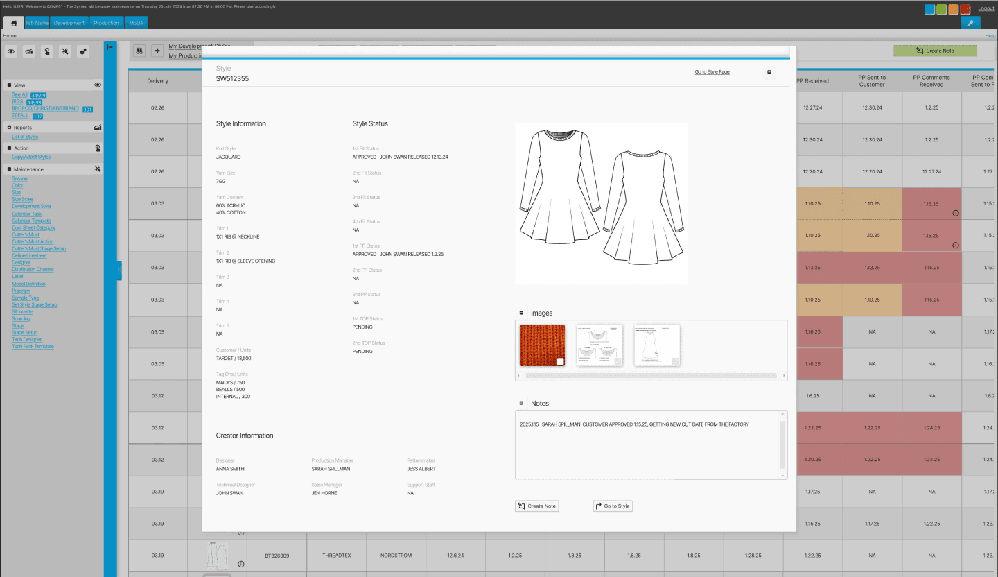
Navigate to the “My Work in Progress” screen
Task #2
Send a note for style SW512355
Outcome
5/5 users successful in completing task #1
5/5 users successful in completing task #2
Patterns
All users were able to complete both tasks with the second task taking significantly more time than the first.
Users looked in the side navigation menu first to find the requested CTA button.
Surprises
Even though all users were able to complete both tasks it was curious how much easier the 1st task was to complete than the 2nd since the 2nd task had more steps.
Considerations
Button visibility for users so they are not too hidden or blended in with other information on the screen is a necessary revision.
The challenge presented is maintaining the original product’s aesthetic, which is quite busy, while also improving the UX.
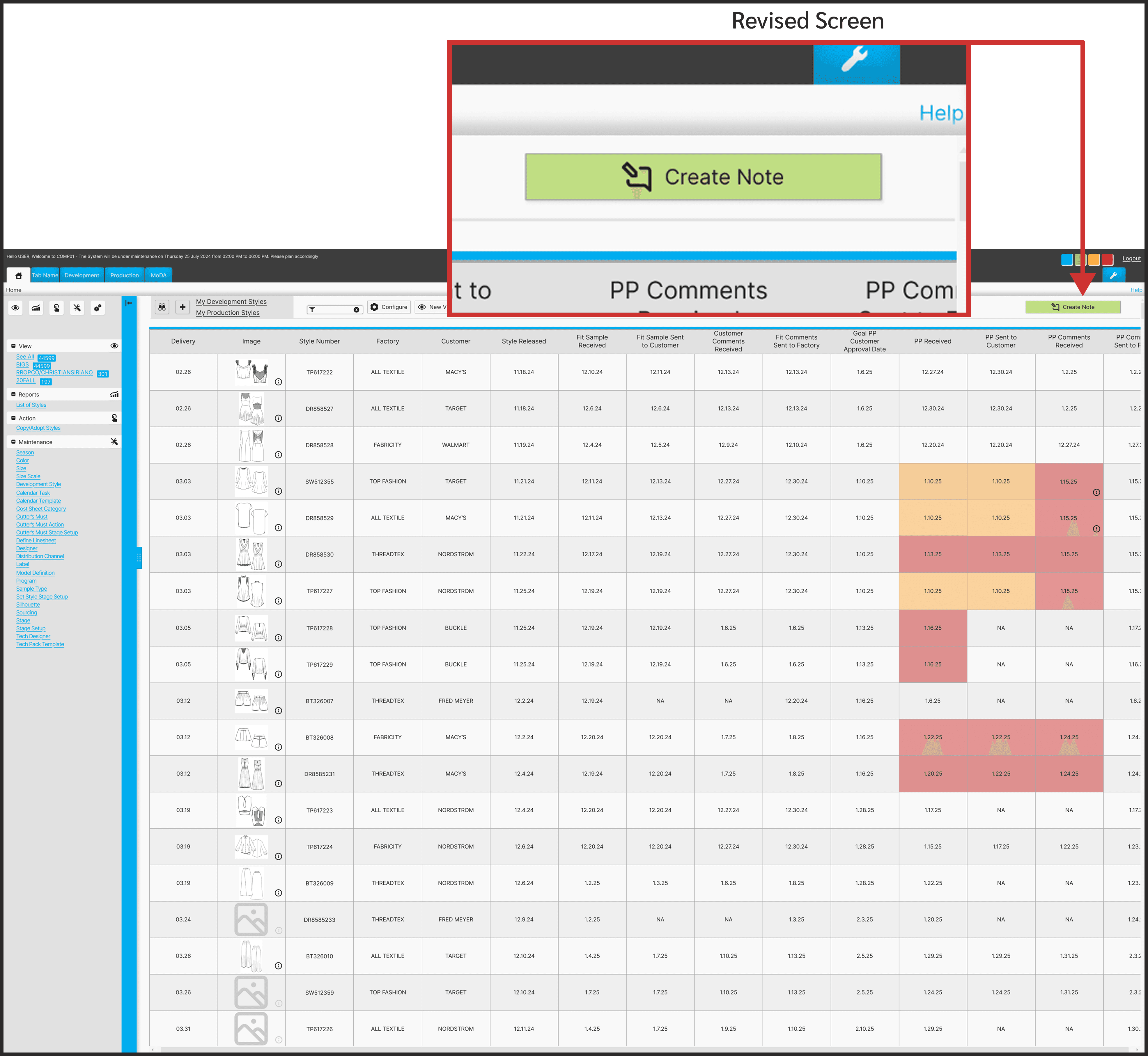
Issue: Hidden Button
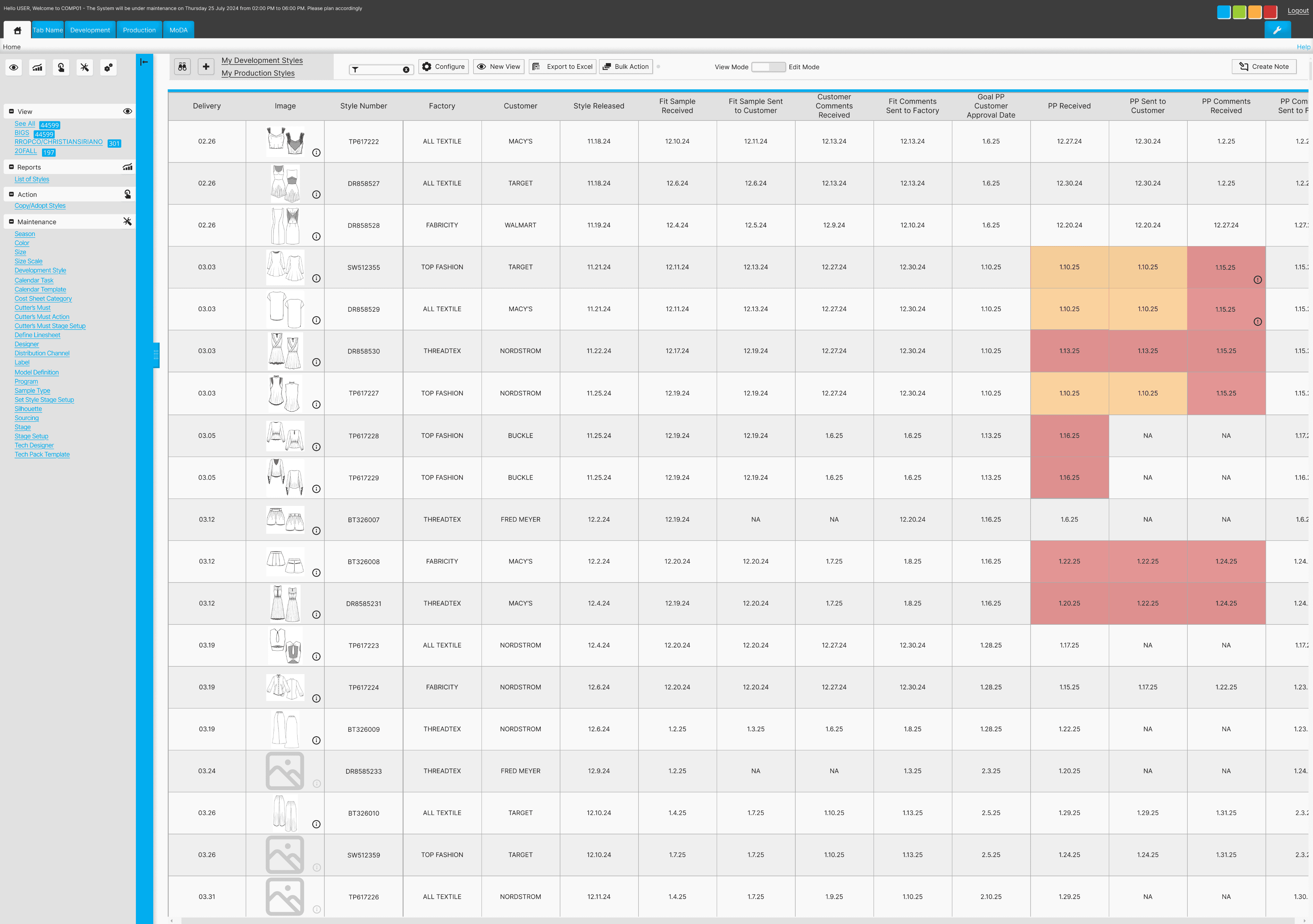
Original Screen
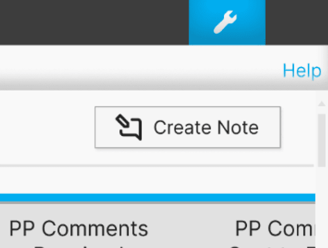
Task Summary
User testing participants were asked to find the correct path in order to send a note.
Problem
Users struggled to find the button to create a note due to its combination of obscurity and positioning.
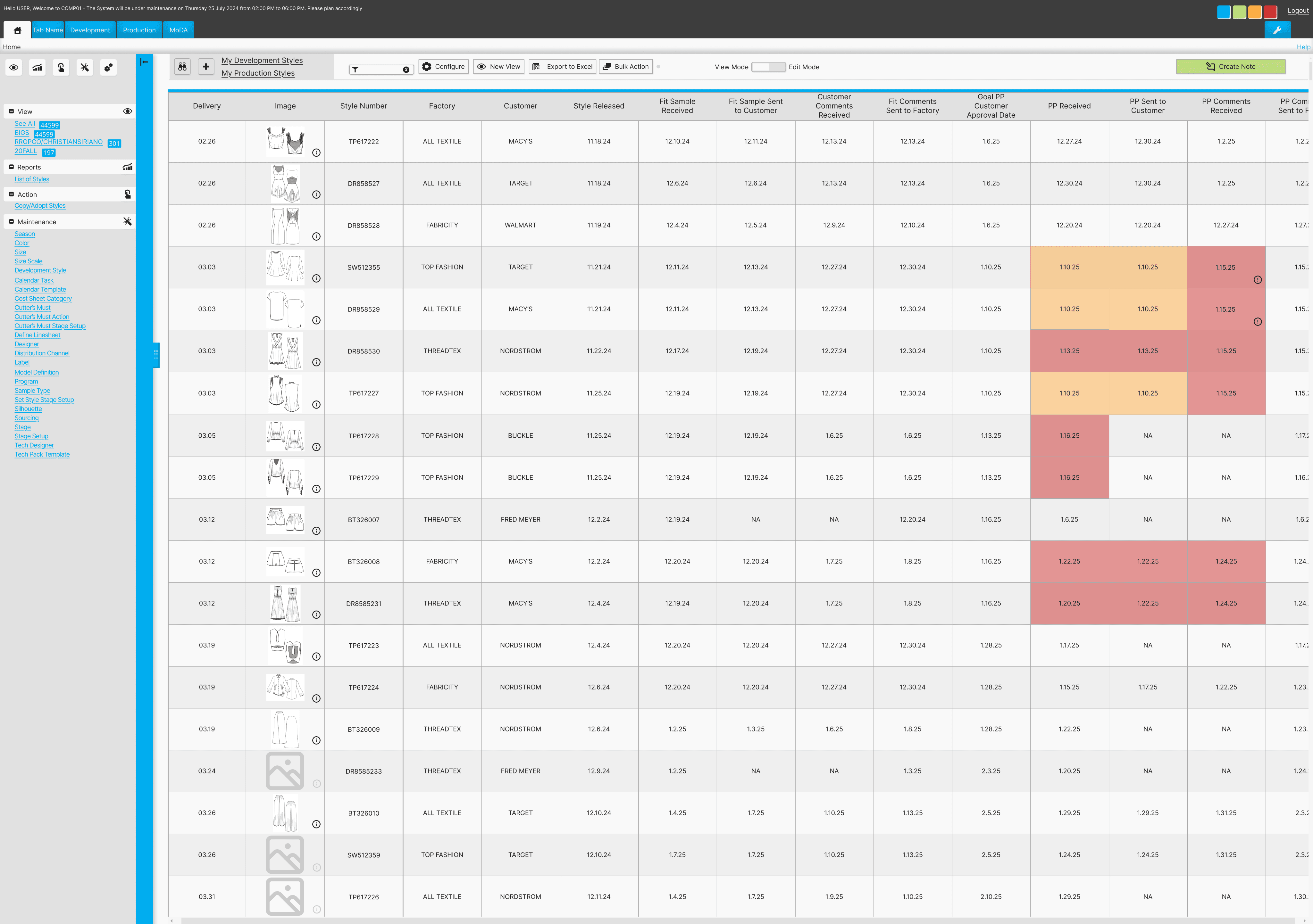
Revised Screen
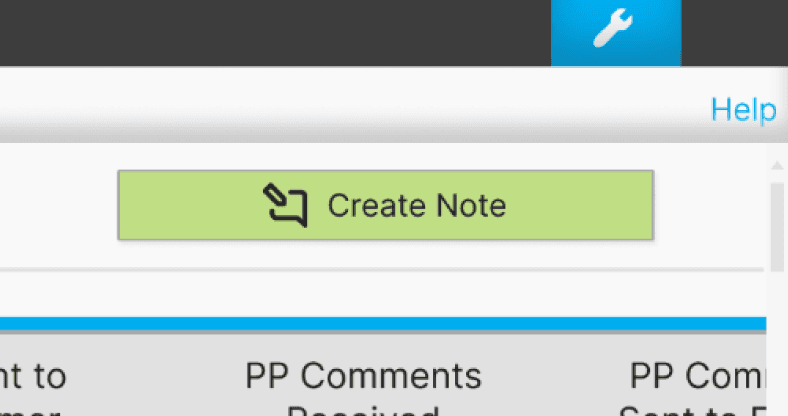
Solution
Increasing the button width and also revising the color to be more attention grabbing will help users easily spot the create note button.
Consideration
Maintaining the overall aesthetic of the original platform was pertinent. Had this not have been an added feature of a preexisting product then a totally different design approach would have been utilized to reduce visual clutter.
Some features leading to user difficulties are:
1. Small text
2. Elements very close together, making it tough for users to easily navigate to their desired links.
3. Repetitive elements and links on the same screen
Conclusion
Challenges
Working on designing only one new feature for a product that has so many user complaints made for quite the challenge.
Maintaining objectively bad design features for users’ best experiences is almost painful. However, if I would have changed the product so much it would have missed the point of the assignment.
Lessons
The area where I gained the most confidence was within the interview portion. It helped having a familiar personal topic in which aided in having more natural conversations with users.
Alternatives
Adding more screens to this prototype would be beneficial to even better show ease of use and the product’s full potential.
Future
It would be interesting to build on this product and improve other areas. Users struggled with finding basic pages and redesigning those paths to be more clear would be rewarding.
Let’s chat!
gracie
bojorquez